
Simple topographical analysis in QGIS
Our digital elevation model is useful on its own, but we can also use it to create completely new data that can give us even more information about our sites and the landscape in which they are situated.
Slope
The first new dataset we are going to create will show us how steep or flat different parts of our area of interest is.
- 1) On the main menu navigate to ‘Raster’ > ‘Analysis’ > ‘Slope’.
- 2) For ‘Input layer’ select your SRTM dataset.
- 3) For ‘Ratio of vertical units to horizontal’ type 111,000.
This is like what we did with our hillshade – the elevation values are measured in metres, but the raster uses degrees of latitude and longitude. There are roughly 111km to one degree (111,000m), so we give QGIS this information to calculate the new values accurately.
- 4) Click the browse button next to ‘Slope [Save temporary file]’ and select ‘Save to File’.
- 5) Navigate to your course folder.
- 6) Make sure ‘TIF files (*.tif)’ is selected for ‘Save as type’ (you can find it at the top of the list!).
- 7) Give your new file a name, for example ‘SRTM_Slope’ and click Save.
- 8) Click the Run button.
 Calculating slope.
 A default slope raster.
 The colours make it easier to distinguish the flattest and steepest parts of the landscape.
Can you think of any examples of sites where slope data would help us understand or protect an archaeological site better?
Aspect
- 1) On the main menu navigate to ‘Raster’ > ‘Analysis’ > ‘Aspect’.
- 2) For ‘Input layer’ select your SRTM dataset (not your slope raster!).
- 3) Click the browse button next to ‘Aspect [Save temporary file]’ and select ‘Save to File’.
- 4) Navigate to your course folder.
- 5) Make sure ‘TIF files (*.tif)’ is selected for ‘Save as type’ (you can find it at the top of the list!).
- 6) Give your new file a name, for example ‘SRTM_Aspect’ and click ‘Save’.
- 7) Click the ‘Run’ button.
 Calculating aspect.
 A default aspect raster.
- 8) Right-click your aspect data in the ‘Layers’ panel and select ‘Properties’.
- 9) Click on the ‘Symbology’ tab.
- 10) At the top, change ‘Render type’ to ‘Singleband pseudocolour’.
- 11) Next to ‘Color ramp’ click the small black arrow and then go to ‘Create New Color Ramp’.
- 12) Change the colour ramp type to ‘Catalog: cpt-city’.
- 13) Scroll down until you find ‘Full_saturation_spectrum_CCW’, it looks like a rainbow!
- 14) Select it and click OK.
 Selecting an appropriate colour ramp.
- 15) Click ‘Apply’ and ‘OK’. You will now have a rainbow landscape with north-facing slopes in red, east in purple, south in blue, and west in green!
 A colourful aspect raster.
Can you think of any other reasons why aspect might be useful for archaeologists?
Hydrology
- 1) Head to the HydroRIVERS website on your internet browser.
 The HydroRIVERS website.
- 2) Scroll down to the bottom of the page and find the ‘Shapefile’ version of the region relevant to your area of interest.
- 3) Click the ‘Download’ link for this dataset.
 Downloading the right data.
- 4) Once it has downloaded, move the ‘HydroRIVERS’ zip file to your course folder.
- 5) Extract the zip file.
 The extracted folder.
- 6) In QGIS, on the main menu navigate to ‘Layer’ > ‘Add Layer’ > ‘Add Vector Layer’.
- 7) Click the browse button and navigate to the HydroRIVERS directory in your course folder.
- 8) Double-click on the second HydroRIVERS folder inside the first (if there is one). You will see six files that all share the same name but have different endings. These six files are actually one part of a single shapefile!
 Adding the shapefile.
- 9) Find the file that ends ‘.shp’, select it and click ‘Open’.
- 10) Click ‘Add’ and then ‘Close’. You should now have a new line layer in your ‘Layers’ panel and a river network in your map window.
 HydroRIVERS data in QGIS.
- 11) Right-click the rivers layer in the ‘Layers’ panel and select ‘Properties’.
- 12) Go to the ‘Symbology’ tab and select the ‘simple blue line’ option.
- 13) Click ‘Apply’ and ‘OK’.
 Blue rivers.
- 14) Right-click the rivers layer in the ‘Layers’ panel and select ‘Properties’.
- 15) At the top change ‘Single Symbol’ to ‘Graduated’.
- 16) For ‘Value’ select ‘UPLAND_SKM’.
‘UPLAND_SKM’ is short for ‘upland square kilometres’ – it refers to the surface area of the drainage basin upstream of every channel.
- 17) Click the little black arrow next to ‘Color ramp’ and select ‘Blues’.
- 18) Click the ‘Classify’ button near the bottom of the window.
- 19) Click ‘Apply’ and ‘OK’.
 Graduated river symbology.
The rivers will now have a different colour depending on how big they are! Larger rivers, draining big areas, will be dark blue, and small streams will be white or pale blue.
 A finished topographic map with elevation, relief and rivers.
Hydrology is hugely important in site prospection and landscape archaeology as all humans need water to survive – in the present and the past! Settlement sites will need a good water source to sustain them, and rivers and streams are one obvious option. The larger the settlement the more water it would have needed which is why such sites are so often found near sizeable rivers. Can you think of why a hydrological map may also be relevant to heritage protection?
Well done for completing Week 4! We have learnt a lot about radar and topographic data. Next, we will be looking at how we can use historic maps and imagery to learn more about archaeological sites.
Advanced Archaeological Remote Sensing: Site Prospection, Landscape Archaeology and Heritage Protection in the Middle East and North Africa
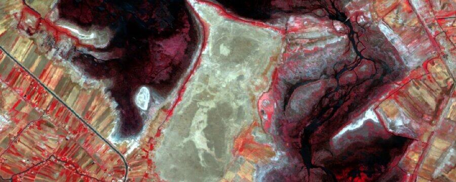

Advanced Archaeological Remote Sensing: Site Prospection, Landscape Archaeology and Heritage Protection in the Middle East and North Africa
Reach your personal and professional goals
Unlock access to hundreds of expert online courses and degrees from top universities and educators to gain accredited qualifications and professional CV-building certificates.
Join over 18 million learners to launch, switch or build upon your career, all at your own pace, across a wide range of topic areas.