Visualising multispectral imagery
We’ve just explored how we can use satellites to collect data on some parts of the electromagnetic spectrum that we cannot see ourselves. At this point you might ask “if we can’t see them, how do we visualise these kinds of data when looking at satellite imagery”?
Band combinations
Last week we looked at how true colour satellite imagery – imagery that shows the world in colours we would recognise – works. Satellites measure the strength of red, green and blue light for each pixel. These values are then used to display the images on a digital colour screen.
 Just like any other digital image, satellite imagery is displayed using red/green/blue pixels on a digital screen. Sentinel-2 imagery courtesy of ESA.
Instead of viewing a true colour image, it is also possible to examine just the red, green, or blue data, to assess the relative strength of each. These single colour images or datasets are called ‘bands’, because they encompass a range – or band – of wavelengths. One of these bands could, for example, represent the whole green part of the spectrum. Last week we worked with Sentinel-2 data. The diagram below shows which bands cover which wavelengths. Can you spot the red, green and blue bands? They are numbered for easy reference (blue = 2, green = 3, red = 4). Don’t worry about the others yet!
 Wavelengths covered by the different bands of the Sentinel-2 satellites. Based on an image courtesy of NASA.
Although we can view the data for each band individually – which is usually done in grey-scale (with low values shown as dark grey to black, and higher values as light grey or white) –this is not always the most useful approach. The bands make a much more interesting image when we combine them together and show the data in full colour. The relative strength of the red, green and blue bands can then be reflected in the brightness of the red, green and blue pixels, creating a colour image on our screen. However, in contrast to ordinary colour photograph, when using GIS or imaging software, we can actually assign the colours red, green, and blue to whichever band we like to be red, green, and blue. For example, we can mix it up completely and use the green band to plot the pixel values from the red, the blue band for green, and the red band for blue! This may not seem very useful yet, but the value of doing this will become clear shortly!
 Visualising the red (R), green (G) and blue (B) bands separately and as a colour image using various combinations. Their order denotes which band they are being displayed as, where the first position is red, the second is green, and the third is red. For example, RGB is red as red, green as green and blue as blue, but BGR is blue as red, green as green and red as blue! Sentinel-2 imagery, courtesy of ESA.
What do we do if we want to visualise one of the infrared bands? There are no infrared pixels on a computer screen, and we wouldn’t be able to see the light they would produce if there were! So, what we do instead is to plot the pixel values of the band(s) we are interested in using one (or more) of the red, blue or green bands. Let’s look at an example.
 One true colour, and one false colour composite of the Nile delta. Sentinel-2 imagery, courtesy of ESA.
The left-hand image of the Nile delta is what is called a true colour image. It uses the red band for red (4), the green band for green (3), and the blue band for blue (2)! In the righthand image, the green and blue bands have been kept the same, but we have not plotted the red pixel values using the red band. Rather we have omitted the red pixel values (4) and have used red band to plot the pixel values of one of the near infrared bands (8), so the image looks completely different! This sort of image is called a “false colour” composite.
There is a standard notation for multispectral images that lists three numbers, for example 8/3/2 in the above false colour image. These numbers refer to the bands of the satellite imagery being used to create a composite image. The positions are important as they reveal which colour is being used to display each band. The first position is for red, the second is for green and the third is for blue. So, 8/3/2 tells us that band eight is being visualised using red, band 3 for green and band 2 for blue!
 When sunlight hits a plant, it absorbs red and blue light for photosynthesis, reflects a high proportion of the green light, and strongly reflects infrared light (the black arrows). Courtesy of William Deadman.
 This natural-like composite of Bahrain uses two infrared bands (12 and 8) alongside the green band of visible light (3) to provide a recognisable but exaggerated colour palette which highlights differences in land surface cover. Sentinel-2 (12/8/3) image, courtesy of ESA.
 This composite of Lebanon’s Bekaa valley uses the standard false colour combination to show up areas of vegetation in red, here the green areas are bare soil. Sentinel-2 (8/4/3) image, courtesy of ESA.
 This composite of Baghdad uses two infrared bands in a combination that is especially good for highlighting urban areas. Sentinel-2 (12/11/4) image, courtesy of ESA.
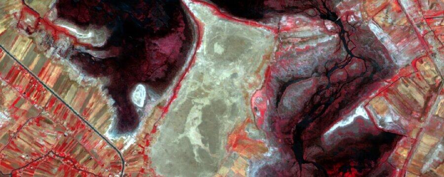
 This composite of part of the marshlands of southern Iraq uses two infrared bands in a combination that is especially useful for distinguishing land, water and vegetation in wetland areas. Sentinel-2 (8/11/4) image, courtesy of ESA.
 This composite of Wadi Jizzi in Oman combines a short infrared band with green and blue bands that is great for distinguishing between areas of different geology / soil cover. Sentinel-2 (11/3/2) image, courtesy of ESA.
Which one of these band combinations would be most useful in your area of interest and why?
Advanced Archaeological Remote Sensing: Site Prospection, Landscape Archaeology and Heritage Protection in the Middle East and North Africa

Advanced Archaeological Remote Sensing: Site Prospection, Landscape Archaeology and Heritage Protection in the Middle East and North Africa


Reach your personal and professional goals
Unlock access to hundreds of expert online courses and degrees from top universities and educators to gain accredited qualifications and professional CV-building certificates.
Join over 18 million learners to launch, switch or build upon your career, all at your own pace, across a wide range of topic areas.
Register to receive updates
-
Create an account to receive our newsletter, course recommendations and promotions.
Register for free


