
Why Create Exploratory Visualisations in Excel?
Visualising data is often the most effective way to describe, explore, and summarise a set of numbers, especially for very large data sets. Generally speaking, there are two categories of data visualisation: exploratory and explanatory.
In this topic we’ll focus on exploratory data visualisations. As you’d expect, exploratory visualisations are used in the exploration phase of your analysis, when you’re becoming familiar with the data. Translating the data into a visual medium can help you to quickly identify features, trends, or anomalies.
Explanatory data visualisations, on the other hand, are applied at the end of an analysis, when you want to communicate insights from your data. At this point you know what your data has to say and you’re trying to tell that story to someone else (eg, your colleagues, external stakeholders, or the general public).
Because these two types of visualisation serve different purposes, your approach to creating them will be different, as will the tooling (to an extent). In this activity we’ll use Excel to create exploratory visualisations.
The power of exploratory visualisations
To understand the power of exploratory visualisations, we can look at Anscombe’s Quartet[1] to counter the belief (common in 1973) that graphs were ‘rough’, and only numerical calculations offered a precise way to interpret data.
Anscombe constructed four data sets, each containing two sets of values: x and y. These are shown below, labelled I–IV.
| I | II | III | IV | ||||
|---|---|---|---|---|---|---|---|
| X | Y | X | Y | X | Y | X | Y |
| 10.0 | 8.04 | 10.0 | 9.14 | 10.0 | 7.46 | 8.0 | 6.58 |
| 8.0 | 6.95 | 8.0 | 8.14 | 8.0 | 6.77 | 8.0 | 5.76 |
| 13.0 | 7.58 | 13.0 | 8.74 | 13.0 | 12.74 | 8.0 | 7.71 |
| 9.0 | 8.81 | 9.0 | 8.77 | 9.0 | 7.11 | 8.0 | 8.84 |
| 11.0 | 8.33 | 11.0 | 9.26 | 11.0 | 7.81 | 8.0 | 8.47 |
| 14.0 | 9.96 | 14.0 | 8.10 | 14.0 | 8.84 | 8.0 | 7.04 |
| 6.0 | 7.24 | 6.0 | 6.13 | 6.0 | 6.08 | 8.0 | 5.25 |
| 4.0 | 4.26 | 4.0 | 3.10 | 4.0 | 5.39 | 19.0 | 12.50 |
| 12.0 | 10.84 | 12.0 | 9.13 | 12.0 | 8.15 | 8.0 | 5.56 |
| 7.0 | 4.82 | 7.0 | 7.26 | 7.0 | 6.42 | 8.0 | 7.91 |
| 5.0 | 5.68 | 5.0 | 4.74 | 5.0 | 5.73 | 8.0 | 6.89 |
Although there are some patterns in the data (ie, the x values are the same for sets I–III), it’s difficult to extract any meaning for the data, even with a relatively small number of values.
If we calculate descriptive statistics for each of the data sets:
- the mean of the x values is 9.0 for each set
- the mean of y values is 7.5 for each set
- the variance of x is 11 for each set
- the variance of y is between 4.122 and 4.1228, depending on the set.
Further analysis, including correlation and linear regressions (you’ll learn about these later in the course) have nearly identical values. All these descriptive calculations suggest the data sets are virtually identical in nature.
What happens when we plot these data sets?
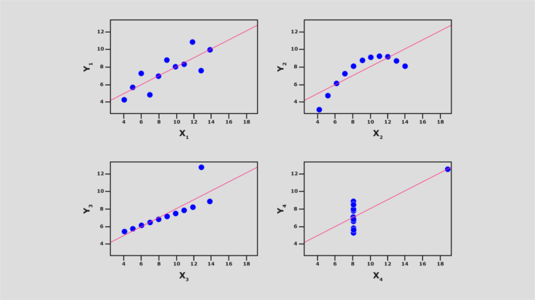
As you can see, the graphs appear very different. (Note: The pink line represents a simple linear regression on the values.) The graph for the first data set is as we might expect; however, the remaining sets show very different relationships in the data. As you can see, even elementary visualisations of data immediately reveal a lot more about the structure than numeric values do.
References
- Anscombe F. Graphs in statistical analysis. The American Statistician. 1973 Feb;27(1):17–21. Available from: https://www.jstor.org/stable/2682899?seq=1


Reach your personal and professional goals
Unlock access to hundreds of expert online courses and degrees from top universities and educators to gain accredited qualifications and professional CV-building certificates.
Join over 18 million learners to launch, switch or build upon your career, all at your own pace, across a wide range of topic areas.


